Optimising images for High DPI displays Published on: May 9, 2022
Over the last decade, we’ve gone from having a home PC to having a pocket PC that can access the internet everywhere. It came with plenty of freedom and new problems to solve. For example, we had to figure out how to present content on different screens.
This was answered through responsive design, meaning that we could rely on one codebase with adaptive layouts depending on the output device. Say you had a website with a large image for desktop computers that you wanted to display on mobile devices with smaller screens.
When you write HTML code you could use the srcset attribute on the image tag or a picture tag. Subsequently, the same image would be available in different sizes, and the browser would select the appropriate version.
However, the problems don’t stop at adapting to different screen sizes. There’s another characteristic called DPI. Let’s discuss this concept in detail using this photo of a gorgeous cheetah to remind us how quickly we would like our images to load.
DPI stands for “Dots Per Inch.” Initially, this term was mostly used to refer to an attribute of devices that put digital images onto paper and vice versa. These included scanners and printers. Therefore, DPI wasn’t a big concern for web content.
Leave a Comment


Recent Posts
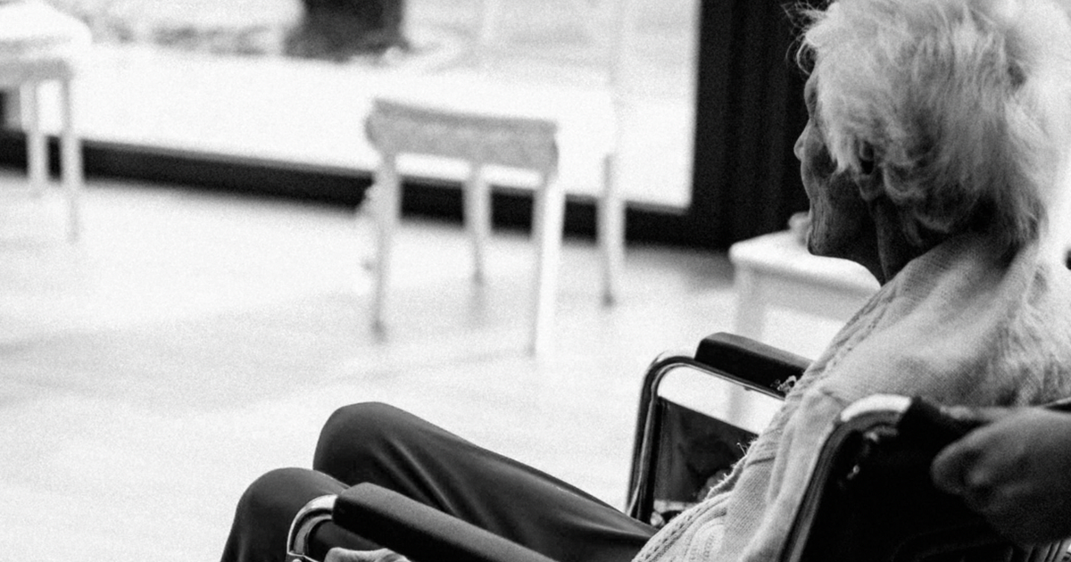
Senate Permanent Subcommittee on Investigations Releases Majority Staff Report Exposing Medicare Advantage Insurers' Refusal of Care for Vulnerable Seniors
Comment


Don Norman: ‘Apple has fallen prey to the most disastrous part of design, which thinks it’s about making something beautiful and elegant’
Comment