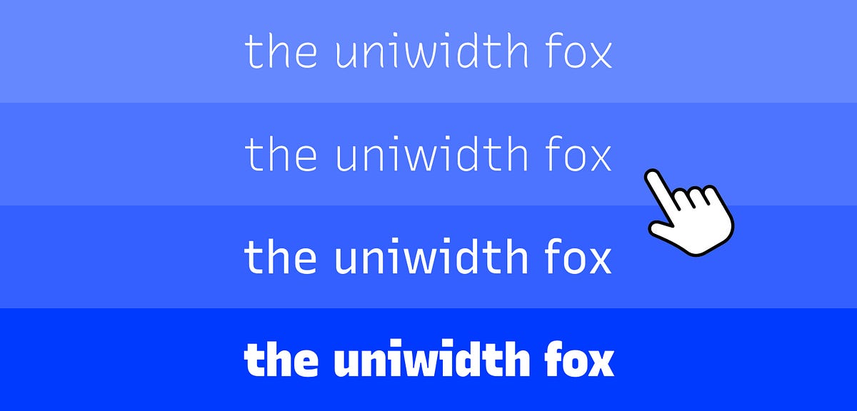
Uniwidth typefaces for interface design
As a web/interface/visual designer I work a lot with label states. Selected, unselected, active, inactive, available, out of stock. Considering that you should never use color as the only visual cue (always remember accessibility dear designer), text weight is often my go-to solution. However, if you’ve ever worked with precisely designed interfaces before, you know how frustrating it can be to find your painstakingly placed labels shoot around like flipper balls when you switch them from regular to bold.
The solution to this problem: “uniwidth” typefaces, sometimes also called “equal-width”, “duplexed” or “multiplexed” typefaces. And no, I am not talking about monospaced fonts here.
A short clarification for the non-type nerds: A monospaced font, also called non-proportional font, is a font whose letters and characters each occupy the same amount of horizontal space (e.g. an uppercase A is the same width as a lowercase w, or a €-sign ). Monospaced fonts are traditionally used for typewriters, or nowadays for setting computer code.
Uniwidth typefaces, on the other hand, are proportionally-spaced typefaces, but every character occupies the same space across different cuts or weights. What this means in practice is that no matter which weight you set your text in, it will never change its length or cause text to reflow.













/cdn.vox-cdn.com/uploads/chorus_asset/file/25651011/1590512040.jpg)


