Dynamic scientific visualizations in the browser for Python users
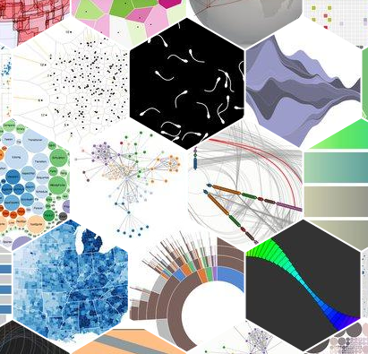
As a scientist, interacting with data allows you to gain new insight into the phenomena you’re studying. If you read the New York Times, the D3 docs or you browse distill, you’ll see impressive browser-based visualizations – interactive storytelling that not only accurately represent data but bring your attention to surprising aspects of it. Making good visualizations of your work can increase the accessibility of your research to a wide audience. My favorite example here (already several years old) is the semantic map of the brain from James Gao, Alex Huth, Jack Gallant and crew – at the time, visualizing brain map data in the browser was unheard of, and here was a visualization of how semantics map to different brain areas, in the browser, no downloads necessary.
Coming from the Python world, most visualizations you’ll make on a day-to-day basis will be very different from these: static plots, because that’s what’s convenient to make in matplotlib. How can you go from the Python world of static plots to the wizardry of Javascript?
Leave a Comment
Related Posts


