Linking excess deaths and SARS-CoV2 vaccinations in Scotland
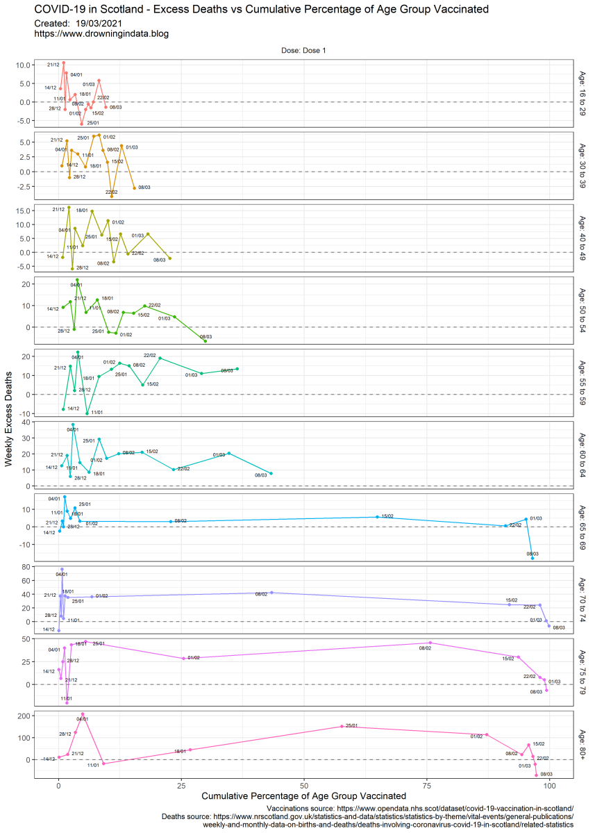
One simple way of showing a relationship between two datasets is to graph one against the other. This is made more complex with a changing situation like monitoring the rollout of a vaccine. The vaccine programme has ensured that around 95% of Scotland’s most elderly population has now had their first dose of either the Pfizer or AstraZeneca vaccines. I’ve linked these together in this way:
This way I create a graph that shows the relationship between time, excess deaths and the percentage of each age group vaccinated.
Our hope is that over time the number of excess deaths (which is expected to be caused mainly by COVID-19) should reduce as the percentage of the population vaccinated increases.
So I start with calculating excess deaths. This uses the average deaths over the previous 5 years (2015-2019) and is defined as Excess Deaths = Deaths in 2020 and 2021 minus Average Deaths for 2015-2019. I’ve calculated excess deaths for each week and for every age group available. The 2015-2019 and 2020-2021 deaths are available from the National Records of Scotland. I calculated the whole country deaths by summing the deaths for every health board for each of the age groups.
One thing to note is that the age groups for vaccinations and excess deaths are different. Thankfully, they generally overlap nicely except for 16-29 (vaccinations) and 15 to 19, 20 to 24 and 25 to 29 (excess deaths). However, this has little effect on the general picture as very few 15 year olds die each week.
Leave a Comment
Related Posts
Using Household Rosters from Survey Data to Estimate All-cause Mortality during COVID in India
Comment




/cdn.vox-cdn.com/uploads/chorus_asset/file/25416391/STK473_NET_NEUTRALITY_CVIRGINIA_C.jpg)


/cdn.vox-cdn.com/uploads/chorus_asset/file/25415669/1238020424.jpg)

