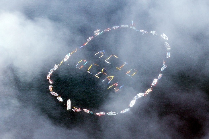
![Warming stripes (sometimes referred to as climate stripes,[3][4][5][Note 1] climate timelines[6] or stripe gra](https://upload.wikimedia.org/wikipedia/commons/thumb/d/d1/20181204_Warming_stripes_%28global%2C_WMO%2C_1850-2018%29_-_Climate_Lab_Book_%28Ed_Hawkins%29.png/1200px-20181204_Warming_stripes_%28global%2C_WMO%2C_1850-2018%29_-_Climate_Lab_Book_%28Ed_Hawkins%29.png "Warming stripes - Wikipedia")
Warming stripes - Wikipedia
Warming stripes (sometimes referred to as climate stripes,[3][4][5][Note 1] climate timelines[6] or stripe graphics[7]) are data visualization graphics that use a series of coloured stripes chronologically ordered to visually portray long-term temperature trends.[2][Note 2] Warming stripes reflect a "minimalist"[2][5] style, conceived to use colour alone to avoid technical distractions and intuitively convey global warming trends to non-scientists.[8][9]
The initial concept of visualizing historical temperature data has been extended to involve animation,[10] to visualize sea level rise[11] and predictive climate data,[12] and to visually juxtapose temperature trends with other data such as atmospheric CO 2 concentration,[13] global glacier retreat[14] and precipitation.[4]
In May 2016, to make visualizing climate change easier for the general public, University of Reading climate scientist Ed Hawkins created an animated spiral graphic[17] of global temperature change as a function of time, a representation said to have gone viral.[9][18] Jason Samenow wrote in The Washington Post that the spiral graph was "the most compelling global warming visualization ever made",[19] before it was featured in the opening ceremony of the 2016 Summer Olympics.[10] Then, on 22 May 2018, Hawkins published[20] graphics constituting a chronologically ordered series of coloured vertical stripes that he called warming stripes.[9] Hawkins, a lead author for the IPCC 6th Assessment Report, received the Royal Society's 2018 Kavli Medal, in part "for actively communicating climate science and its various implications with broad audiences".[21]
Leave a Comment


Recent Posts


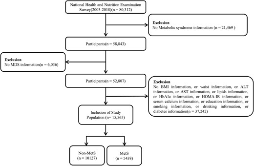
Magnesium Depletion Score and Metabolic Syndrome in US Adults: Analysis of NHANES 2003 to 2018
Comment