How Apple Is Giving Design A Bad Name
Once upon a time, Apple was known for designing easy-to-use, easy-to-understand products. It was a champion of the graphical user interface, where it is always possible to discover what actions are possible, clearly see how to select that action, receive unambiguous feedback as to the results of that action, and have the power to reverse that action–to undo it–if the result is not what was intended.
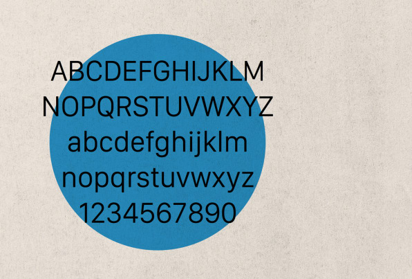
No more. Now, although the products are indeed even more beautiful than before, that beauty has come at a great price. Gone are the fundamental principles of good design: discoverability, feedback, recovery, and so on. Instead, Apple has, in striving for beauty, created fonts that are so small or thin, coupled with low contrast, that they are difficult or impossible for many people with normal vision to read. We have obscure gestures that are beyond even the developer’s ability to remember. We have great features that most people don’t realize exist.
The products, especially those built on iOS, Apple’s operating system for mobile devices, no longer follow the well-known, well-established principles of design that Apple developed several decades ago. These principles, based on experimental science as well as common sense, opened up the power of computing to several generations, establishing Apple’s well-deserved reputation for understandability and ease of use. Alas, Apple has abandoned many of these principles. True, Apple’s design guidelines for developers for both iOS and the Mac OS X still pay token homage to the principles, but, inside Apple, many of the principles are no longer practiced at all. Apple has lost its way, driven by concern for style and appearance at the expense of understandability and usage.


/cloudfront-us-east-1.images.arcpublishing.com/pmn/2OMDYOYIKRDYJOSDNJCST4GN34.jpg)


