- UI")
Mandalorian (Season 2) - UI
Here’s a look at the various HUDS and GUIS from The Mandalorian (Season 2). What’s good about the UI design and the series itself is that it leverages what was great about the original Star Wars films rather than trying to reinvent the wheel. The UI, props, costumes, vehicles, environment and even the classic screen wipes hark back to the style and direction set out in the original films. As a result The Mandalorian feels like a ‘Star Wars story’, it stays true to the art direction and design language. The prequels were a good example of how jarring it can be when you go too far down the other way.
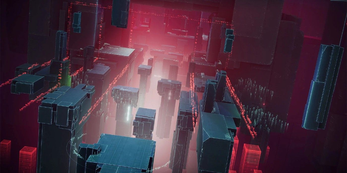
Below are a bunch of interfaces from Season 2. You’ll see several examples of ‘retro future’ looking UI on retro-looking hardware, instead of the slick, polished designs we’re used to today, which would have otherwise lost all the charm and nostalgia that comes with Star Wars . It’s gritty and grainy, nothing is HD or 4K! Everything is in CRT resolution, glitchy, and controlled with tactile controls. There’s a really interesting niche in this type of ‘retro future’ tech which is a big nod to films from the 80s-90s like Star Wars and Blade Runner (see Blade Runner article). The Mandalorian clearly recognised this and has embraced it with both arms. As a result I think The Mandalorian is one of the most successful offshoots from the Star Wars franchise.
The holograms featured are either video based or 3D wireframes of schematics. All are projected from below through a tactile device.
Leave a Comment
Related Posts


Recent Posts


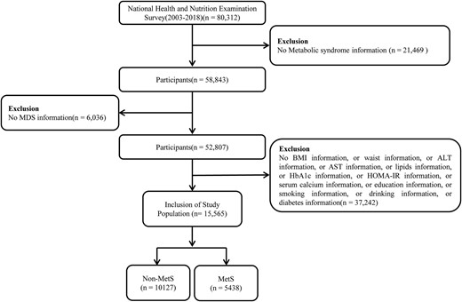
Magnesium Depletion Score and Metabolic Syndrome in US Adults: Analysis of NHANES 2003 to 2018
Comment

Speed of environmental change frames relative ecological risk in climate change and climate intervention scenarios
Comment