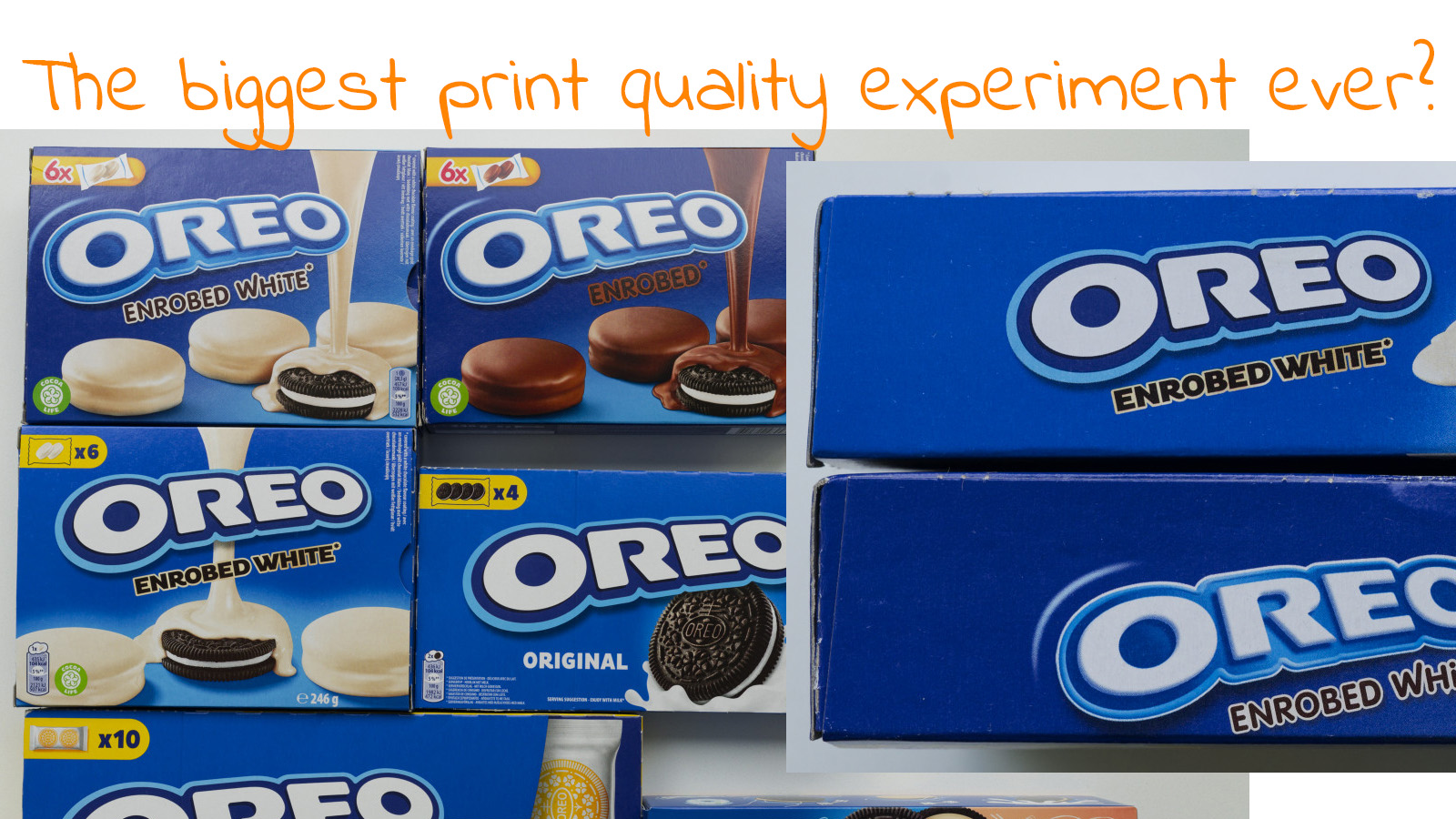
The biggest print quality experiment ever? Brand Colors IRL: the Oreo case
It’s probably – or even better: certainly – not intentional, but Oreo is running the most extensive real-life study on print quality. Why, you might ask. Well: they changed their logo, including the logo color, the brand color. It might look like a subtle change, but the new brand color is about 10 dE00 off the previous one. So, if the old ‘truth’ that color differences in packages will impact sales, Oreo sales should be plummeting right now. Old and new versions are being used jointly in several supermarkets I visited. Some products have the old logo and color, some the new… Let’s check it out!
CONTENTS: Chinese Oreo | The other little experiment | The ‘icky’ part, again… | Why is this important? | Updates
A few weeks ago, I went to the Chinese supermarket, a short bike ride from home. To shop for some Chinese specialties. But when I was in the shop, I noticed they also had Chinese varieties of Oreo… And those packages didn’t look like the Oreo packages I remembered from my ‘regular’ shops. So, I bought one, obviously. To put it next to a Belgian one and write a nice article about it.
But when I put it next to the regular Oreo I bought in a Belgian shop (Delhaize) a few days later, I was in for a surprise! These blues were not that different… My color memory had failed on me, once again. (as an excuse: I’m not an Oreo addict, I otherwise never buy it) Now, that’s not something special: several academic studies have already come to the same conclusion. I’ve covered a few in two articles before (article one, article two).


/cdn.vox-cdn.com/uploads/chorus_asset/file/25654312/STK302_WORDPRESS_B.jpg)


