Content design considerations for the new Firefox
We just launched a major redesign of the Firefox desktop browser to 240 million users. The effort was so large that we put our full content design team — all two of us — on the case. Over the course of the project, we updated nearly 1,000 strings, re-architected our menus, standardized content patterns, established new principles, and cleaned up content debt.
The primary goal of the redesign was to make Firefox feel modern. We needed to concretize that term to guide the design and content decisions, as well as to make the measurement of visual aesthetics more objective and actionable.
To do this, we used the Microsoft Desirability Toolkit, which measures people’s attitudes towards a UI with a controlled vocabulary test. Content design worked with our UX director to identify adjectives that could embody what “modern” meant for our product. The UX team used those words for early visual explorations, which we then tested in a qualitative usertesting.com study.
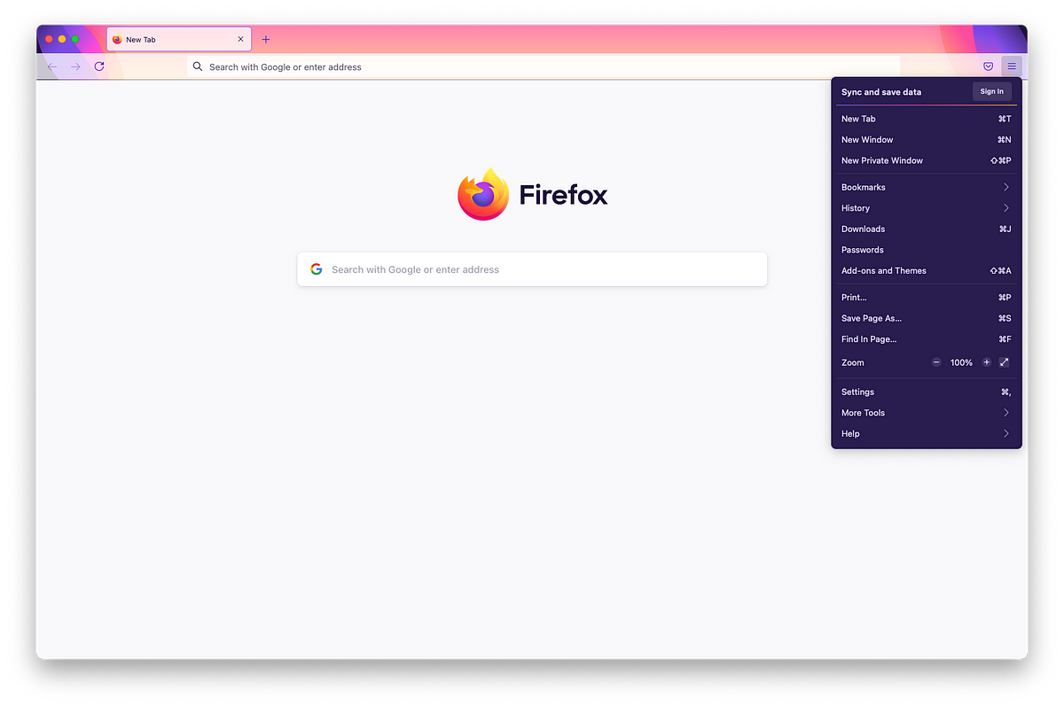
Over time, our application menu had grown unwieldy. Sub-menus proliferated like dandelions. It was difficult to scan, resulting in high cognitive load. Grouping of items were not intuitive. By re-organizing the items, prioritizing high-value actions, using clear language, and removing icons, the new menu better supports people’s ability to move quickly and efficiently in the Firefox browser.


/https%3A%2F%2Ftf-cmsv2-smithsonianmag-media.s3.amazonaws.com%2Ffiler_public%2F6f%2F64%2F6f64a534-be29-44a3-a883-0c19b5e99984%2Fab1_-_branched_bamboo_coral_3689_7-25-09_jsl_0589.jpg)


/cdn.vox-cdn.com/uploads/chorus_asset/file/25416391/STK473_NET_NEUTRALITY_CVIRGINIA_C.jpg)


