")
Confronting Deceptive Design in App Reviews (and How To Fix Them)
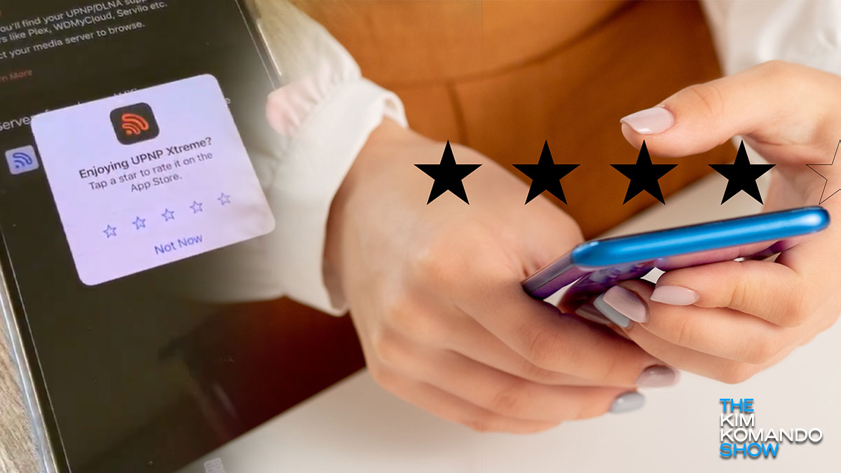
We've all seen it. An app review prompt pops up in an app and asks if you're enjoying it, but it looks a little off. After a bit of investigation, you confirm it: if you give it 5 stars you're promptly redirected to the real App Store rating prompt. However, if you give 4 or fewer stars, you're sent to a generic “feedback” interface that sends your low-star rating to some internal system, or maybe nowhere at all.
This practice, and others like it, are called Deceptive Design (formerly Dark Patterns): UI designed to trick you into doing something against your own interests or intention. They are particularly prevalent in app-store review pre-prompts. But is it always deceptive design to ask users questions before asking them to review? In this blog, we separate the good, the bad, and the downright ugly.
While many “pre-prompts” before an app-store review request are undoubtedly deceptive design, some forms of pre-prompt can be in the user's best interest. In particular, if the user is confusing reviews with a support channel, a pre-prompt can help them reach their goal much quicker. Giving users a clear choice to review can be beneficial to both users and app developers.


/cdn.vox-cdn.com/uploads/chorus_asset/file/23382326/VRG_Illo_STK022_K_Radtke_Musk_Tesla.jpg)
/cdn.vox-cdn.com/uploads/chorus_asset/file/23999788/acastro_STK073_02.jpg)