Last Week on My Mac: Fun and functional
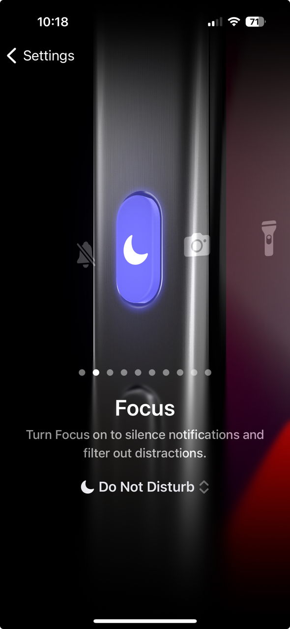
I finally replaced my old iPhone XR with a 15 Pro. Although I’m delighted with the upgrade, there’s one prominent feature that I’m disappointed with, and that’s the new Action Button replacing the Mute (ring/silent) Switch on the left side of its titanium case. The design of the previous switch made inadvertent operation almost impossible, but the new button is all too easy to press accidentally. So I took a look in Settings to discover how to reassign its function, and that’s where I discovered the feature that I most object to. Select the Action Button there to see a travesty of human interface design.
Apple provides ten choices for the Action Button’s function, but rather than using one of several well-proven methods of offering that choice, it took me on a trip to the theatre.
There’s no way to see all ten choices listed together. Instead, you have to swipe from one to the next to discover them one at a time, with each option filling the display. The first time I saw this it was vaguely amusing, but as I’ve been trying to work out my choice, given that the Action Button can be pressed when the phone is in my pocket, Apple’s stageshow has worn thin. I’ve now come to hate the Action Button settings, and have disabled the button.


